Hide this page component - submission to GDS Design System
The project
Working in my delivery team in the Legal Aid Agency I identified a high-risk gap in the UK Government's website that put users at risk. In particular, victims of Domestic Abuse.
Assessing the risk to users, I led a collaborative Government response to create a new component that allows users to quickly hide their current page and open a new, ambiguous webpage, such as BBC Weather. This would lower the risk of drawing attention to browsing habits from a perpetrator.
My role
I led the reponse to this work from the Ministry of Justice, writing the Design System backlog issue, but also coordinated the joined up submission and writing the implementation guidance, working closely with the Head of the GOV.UK Design System to respond to queries.
I was responsible for creating designs from concept through to final delivery and establish the narrative for the delivery team undestand the importance of the user needs.
I was also responsible for coordinating the joint effort of writing the implementation guidance that was submitted to the Design System Working Group, and acted as the single point of contact for all queries from the Head of Interaction Design at GDS.
Working as part of an agile team and establishing a working group
Within the MoJ, I led the multi-disciplinary delivery team throughout the project, working with a:
- Content Designer
- User Researcher
- Product Manager
- Front-end Developer
This work required a cross-government response to the challenge. Using cross Government Slack channels and networking, I identified several Departments that were keen to implement a similar component on their services.
I quickly establised a working group to begin the process of creating a unified approach to this project. Members of the group were from different professions and from:
- Department for Work and Pensions - User Researcher
- Cabinet Office - Product Manager
- Scottish Government - Senior Interaction Designer
I ensured the working group met every few weeks over a period of 6 months to ensure that we were working towards the same goals and were able to discuss how to progress our collaborative work.
The problem
The biggest risk to a victim of Domestic Abuse is homicide and serious physical assaults - this is at its greatest risk when a victim is planning to flee or escape from the perpetrator. Often, one of the first things a victim will do is to speak to someone to make a disclosure about abuse.
The second thing they will do is research and find help online, often using Government services.
-
40,000
Number of calls made to the National Domestic Abuse Helpline in the first 3 months of lockdown
-
50
Number of women and children that have died as a result of DA since lockdown (highest number in 11 years)
-
950%
Website traffic increase to the National Domestic Abuse Helpline website.
By not having a way for users to be able to safely hide their browser, we were putting our users across Government that use our services at risk.
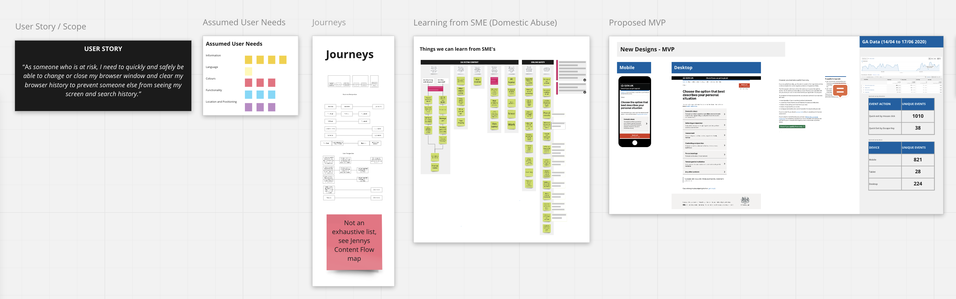
I created the following user story for the delivery team for our us to ensure that we were starting off our work with the basic user needs.
User storyAs someone who is at risk, I need to quickly and safely be able to change or close my browser window and clear my browser history to prevent someone else from seeing my screen and search history.
My approach
Delivery team work
Within the delivery team, we identified through speaking to a subject matter expert - someone who worked with Domestic Abuse survivors - that it was more important to have something than nothing on our service and set out to create an MVP to keep users safe.
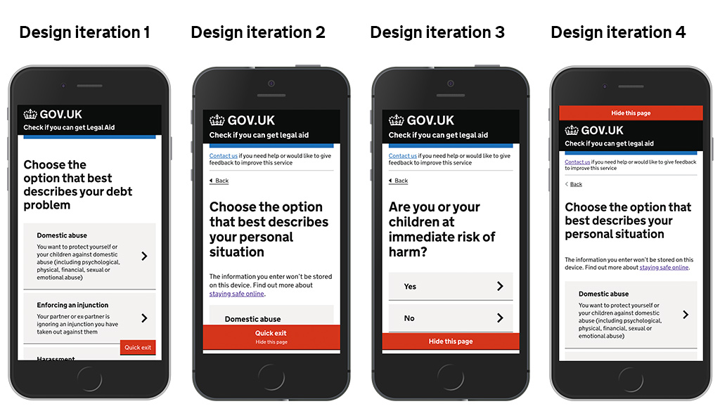
I set out creating rapid sketches to look at user flows through our Legal Aid service and what type of component we would need to create.
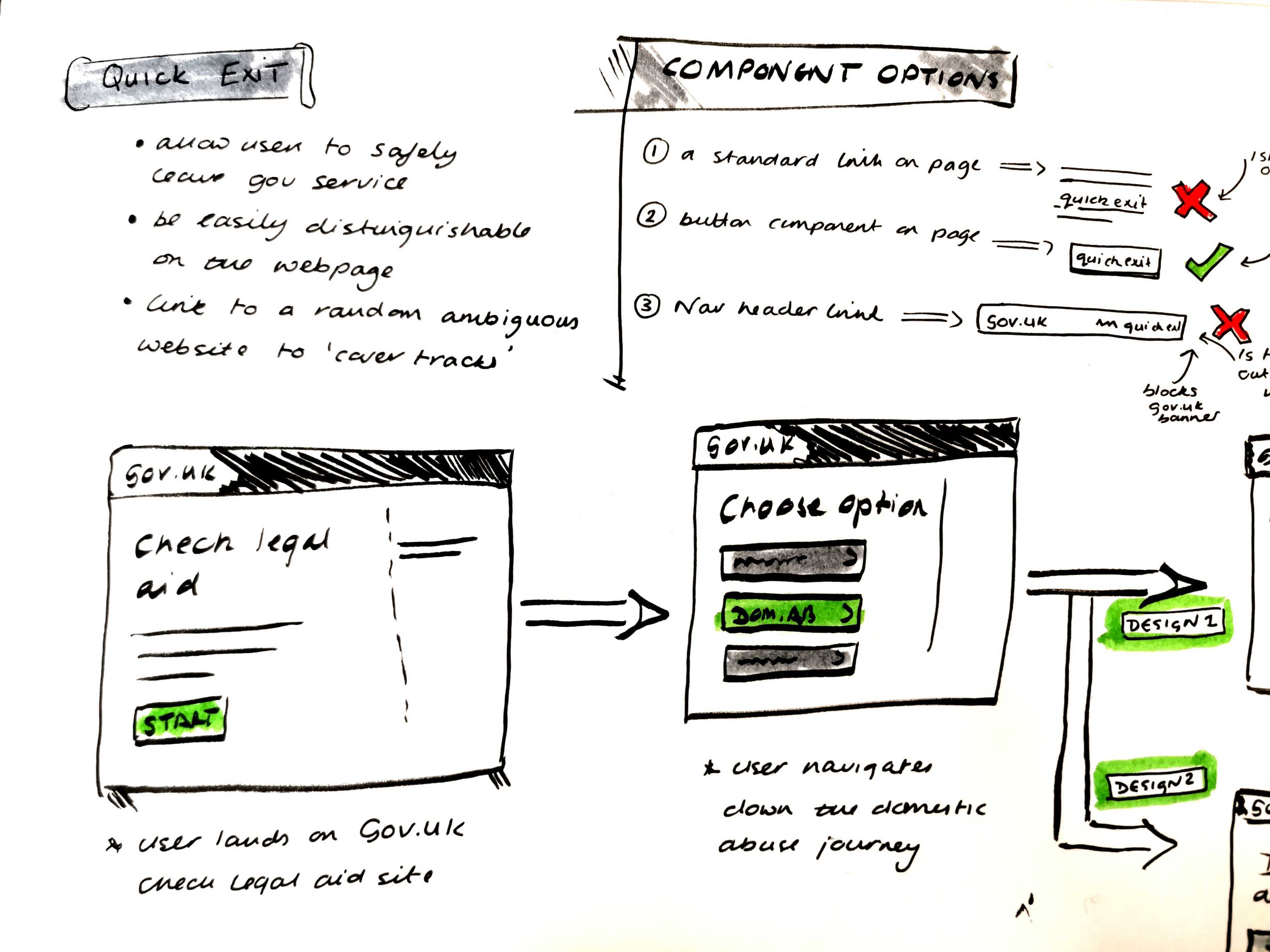
These initial sketches were discussed with the delivery team and the preferred solution was mocked up in a higher fidelity design using the GDS prototyping kit.
Due to the time critical aspect of this work and the fact we were going to be extending the <button> component, I chose to build in the kit to save time.
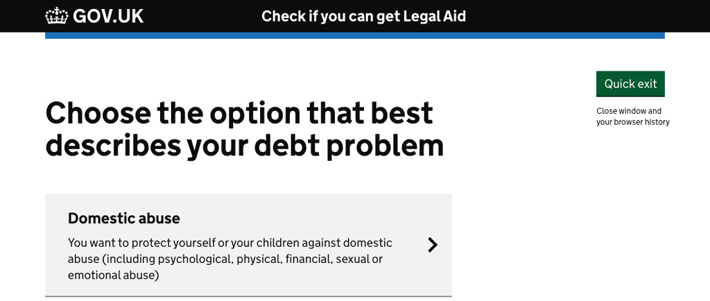
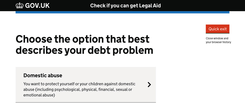
Utilising the Design System, I created two MVP design concepts and presented these back to the Delivery Team. Talking the team through the design options, I proposed we used the red button as it signified a destructive action more clearly than a green button that within the GOV.UK colour palette is used for completing a task.
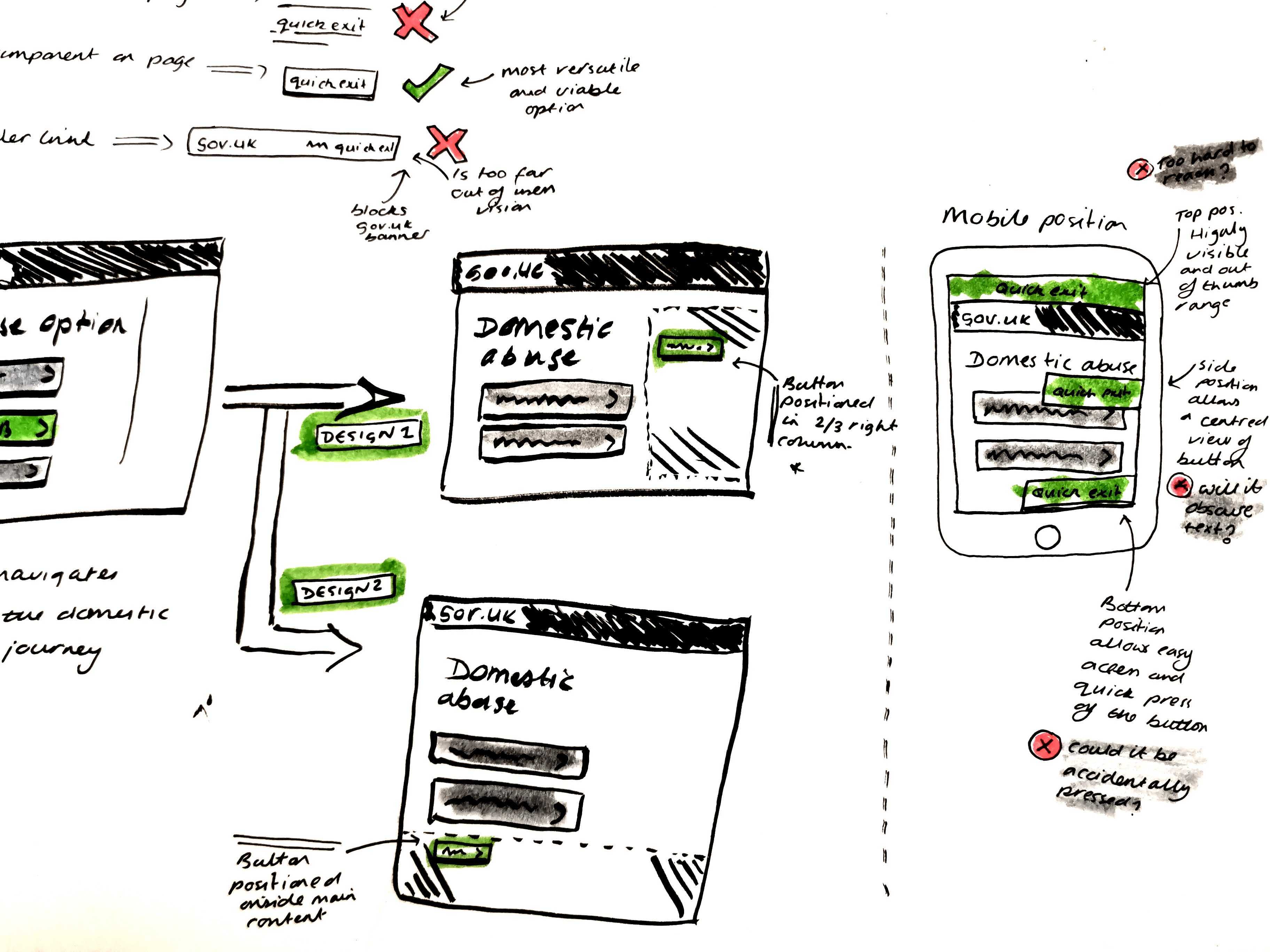
Desktop screen designs using GOV.UK page 2/3 width layout
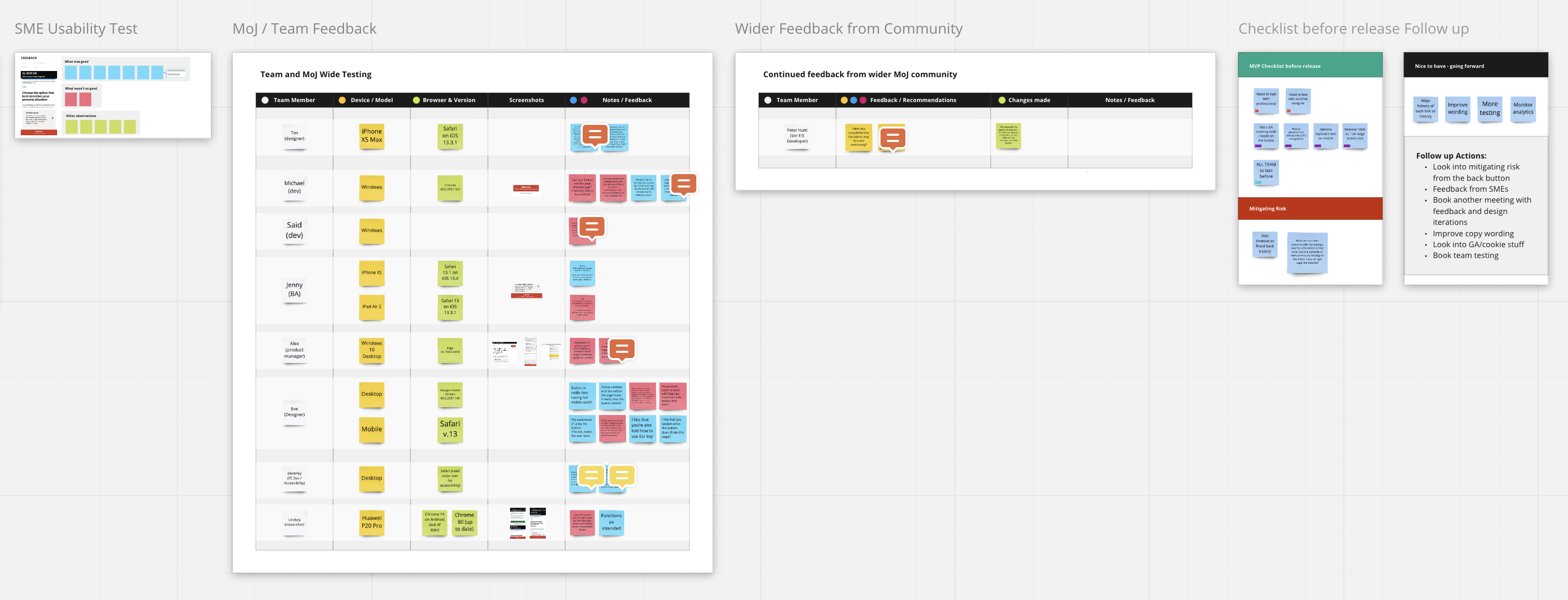
I led on running a design sprint and SME feedback session that allowed us to capture feedback on the component itself, but also identify the risks to users. This was all captured on a miro board which enabled us to have a holistic overview of our approach to the component.
I also used this board to capture feedback from testing of the prototype with the SME, the team and other designers, developers and accessibility specialists across the MoJ. In addition to this, I presented our work to the weekly Design System meeting for feedback.
SME FeedbackVictims of DA are used to using their reptilian brain and are in fight or flight mode so the red would be a trigger for them to draw their to attention to it.
Collecting the data
Although the data continues to be monitored, I identified some trends in users interacting with the button over lockdown. Button use increased during certain points over the last 6 months - these were:
- 24 June 2020 - Spike in use at the start of the football season
- 4 July 2020 - Spike in use as pubs and bars began to open
- 15 August 2020 - Decrease in use as further restrictions lifted, allowing people to return to work and more place to visit open
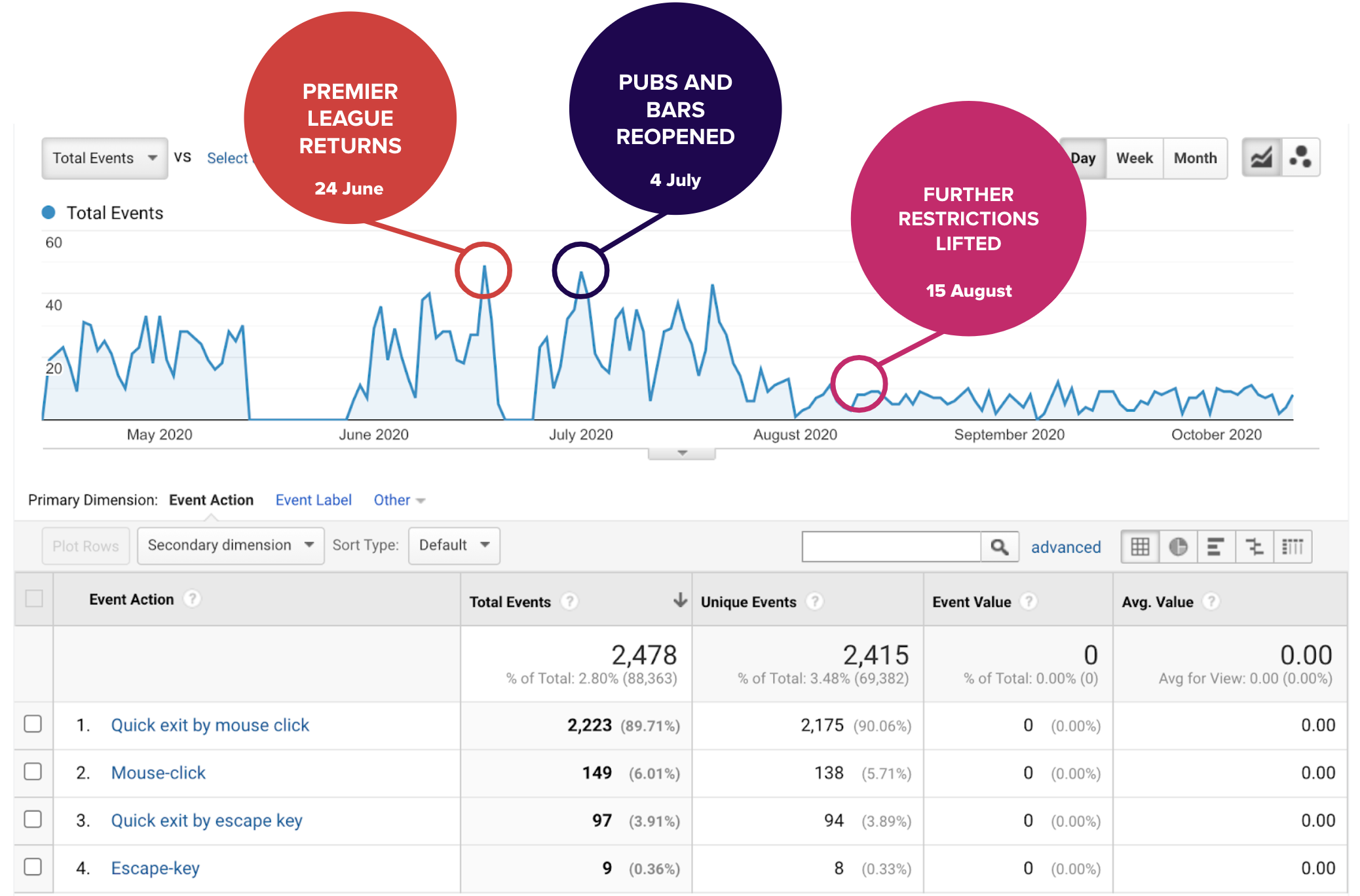
Although this data hasn't influenced the design iterations, it has had a crucial impact on allowing us to see how data from a digital service can help us identify what is happening in the real world.
It is important to note that this data is ever changing and we need to continue to monitor it, especially as we move into another period of lockdown.
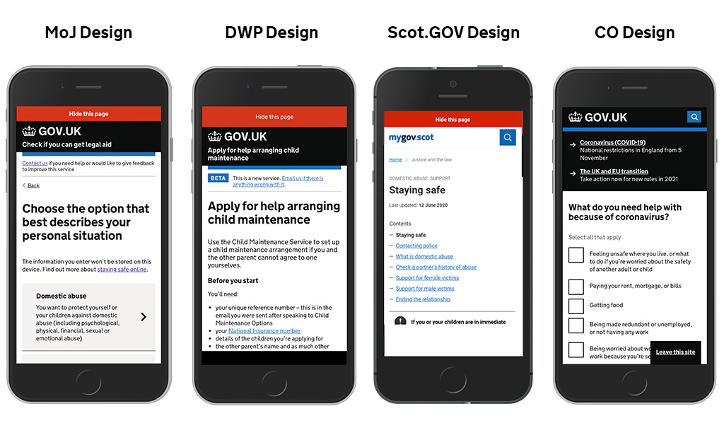
Collaborating with other Government departments
Underpinning all of this MVP work within the MoJ, I coordinated meetings with DWP, Cabinet Office and eventually the Scottish Government. At these sessions, I facilitated the conversations around aligning our design and functionality and ensured that the developers were communicating and code sharing.
At each stage of new iteration I ensured the working group would get together to discuss any changes on the designs to share research and align our designs and functionality.
Iterating on the design and language
At a key meeting, the group discussed changing the language from 'Quick Exit' to 'Hide this page'. This decision was taken because it had been tested by DWP, and tested well with charities.
In addition, the use of 'Hide this page' presented more of a sense of immediacy, as well as being more descriptive of what the button actually does when the user interacts with the button, so we moved away from 'Quick Exit'.
Another important design iteration was the positioning - as a collective group, we agreed that having the button at the bottom of the screen could cause accidental interactions, causing frustration to users. Additionally, it blocked other components on GOV services, such as the 'content' sticky element.
This decision by collaboration, resulted in positioning the button at the top of the screen (on mobile).
Sharing accessibility testing outcomes across GOV
The LAA - Check Legal Aid team had an Accessibility Audit on their service and this highlighted some improvements to the component which I shared with the working group to ensure everyone was aware of accessibility issues. These were:
- Ensuring the button text accurately describes it's purpose
- Ensure the instruction "(Or press 'Esc' key)" is presented to all users when presented as a sticky element
- Include visually hidden text at the top of the page to help users of assistive technology be aware of the leave page functionality
- Differentiate between mobile displays and PC displays zoomed in, so the information about using the escape key is not hidden for non-mobile narrow displays
These changes have been implemented in the latest version of the component, however we will be looking to further test the accessibility as we continue to iterate on it.
Writing the implementation guidance and GOV.UK submission
This part of the process took a great deal of coordination to bring four departments across two Governments together to collaborate and comment on one central document.
I created the initial Google doc and scheduled several meetings with the working group to finalise implementation guidance that required feedback and input from:
- Developers
- Content Designers
- Interaction Designers
- User Researchers
- Product Managers
As the lead for the group, I arranged for a final session to agree sign-off on the implementation guidance.
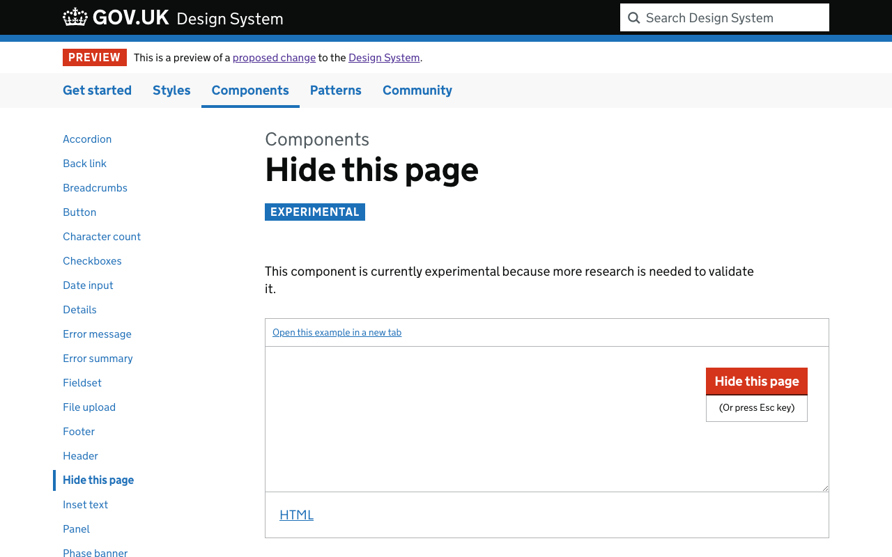
Once we had sign-off, I forked the GOV.UK Design System and created the new component with supporting implementation guidance. This was to allow the GDS Design System Working Group to be able to review the guidance in a real-world example. I created a pull request on github which generated a test version of the Design System which was used to support the component submission.
In addition to this, I liased with the Head of Interaction Design at GDS and the GOV.UK Design System Product Manager to respond to questions circulating the component.
The work that was carried out for this submission has been presented to the GOV.UK Programme Lead as an examplar of what can happen when Government departments work together.
Outcomes
Outcomes for the user
This work has been so important for the Government to be collaborating on and has several positive outcomes for our end users.
- The most important - It helps us keep people safe from harm for anyone using our service to get advice and information about Domestic Abuse or other high risk areas.
- Users will begin to see a consistent design and functional component across not just GOV.UK, but also Scot.GOV.
Outcomes for the organisation
The critical thing for this project of work was first and foremost the user. However, it also has had a big impact on how the Ministry of Justice work collaboratively, and also across wider Governement.
- Established networks and broke down silos of working to collaborate on a consistent design approach across departments and Governments.
- Prompted a new 'Online Safety Working Group' to form across Government to look at designs and best practice when designing services, components and patterns which I am a member of.
- Highlighted how agile delivery teams react to urgent situations and design and develop user-centered solutions at pace.
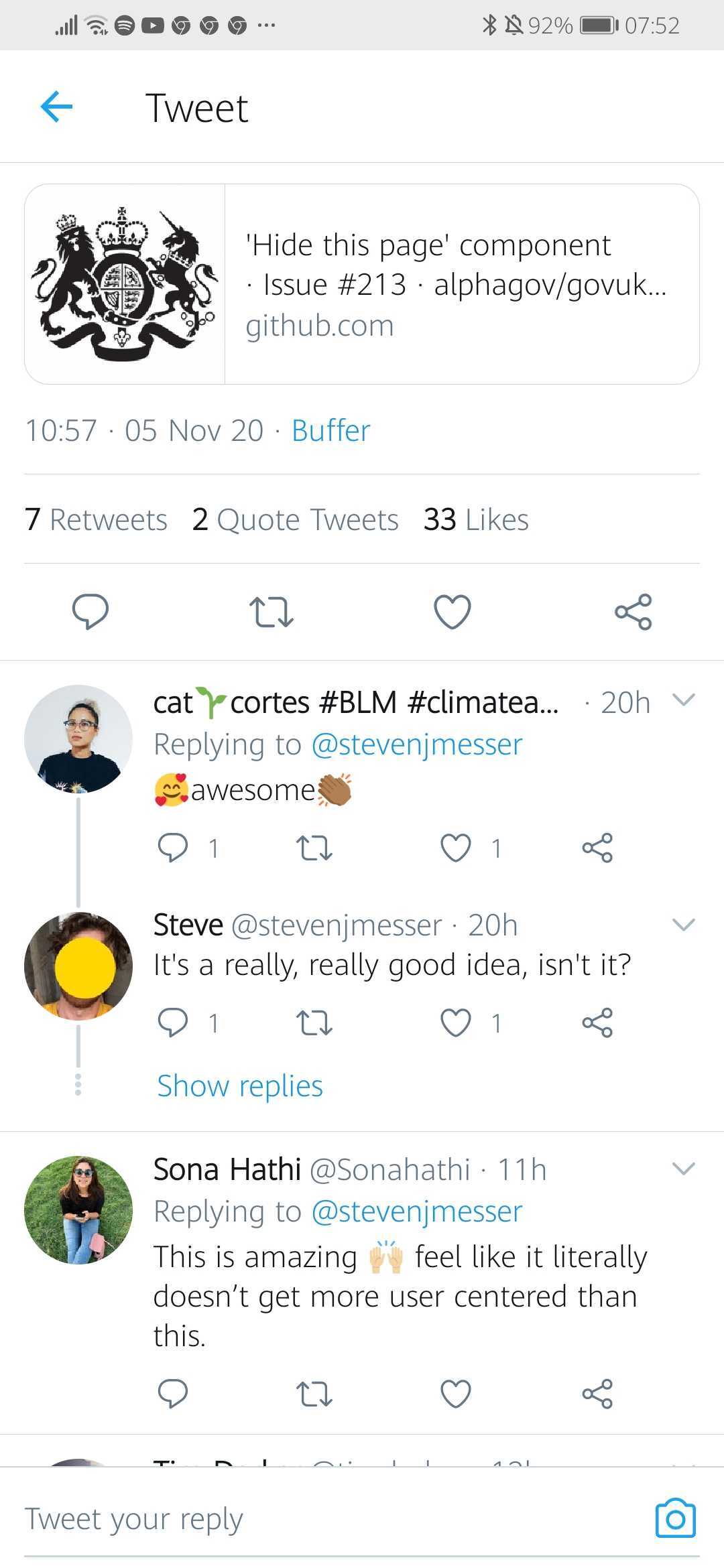
In addition to the above outcomes, the work is being discussed across Twitter with one user positively commenting on the collaborative, user centered approach.
TweetThis is amazing! Feel like it literally doesn't get more user centered than this.